Asana Dashboards: Reporting, KPIs, and Workload Views
What Asana Dashboards Show
A dashboard in Asana is a project-level or cross-project view made of cards. Each card visualises a slice of task data: counts, sums, dates, custom field rollups.
Most teams build one dashboard per active project and one team-level dashboard rolling up across projects. Beyond that, dashboard sprawl starts to outpace signal.
- Project progress — tasks completed over time, completion rate, milestone status
- Due work — overdue, upcoming, completed; usually as bar charts or number cards
- Tasks by owner, status, label — bar chart sliced by custom field or status
- Goal data — Advanced plan; progress towards goals linked to the project
- Workload data — Advanced plan; capacity vs assigned work per person
- Time data — Advanced plan; total time logged per task, project, or person
Dashboards are project artifacts in Asana. They live on the project, inherit project permissions, and travel with the project when shared.
One dashboard per project, one team-level rollup. Sprawl past that and signal degrades.
Dashboard Cards and Chart Types
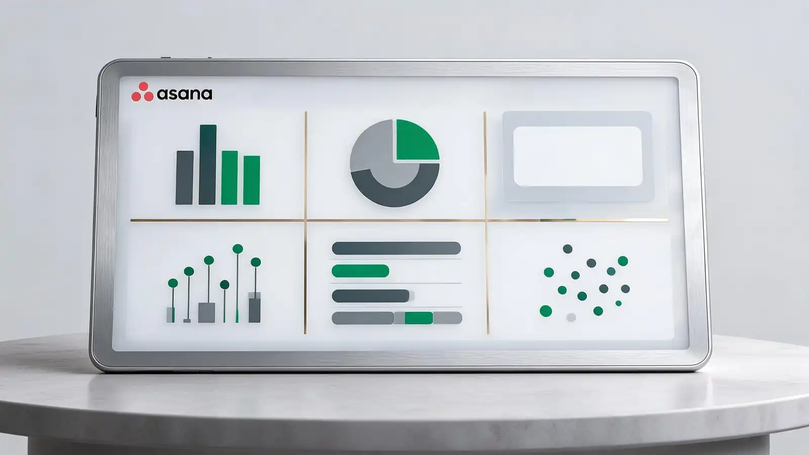
Asana offers six chart types: bar, pie, number, lollipop, list, and scatter. Bar and number cards do the heavy lifting; the others have specific niches.
Pick chart types for legibility, not variety. Six bar charts beat one of each; readers absorb the same shape faster than they parse six different shapes.
| Chart | Best use | Avoid for |
|---|---|---|
| Bar | Counts by category (owner, status, type) | Time series — use a trend line if available |
| Number | Single headline metric (overdue count, total tasks) | Comparisons — bar is better |
| Pie / Donut | Proportions in a small set (3–5 slices) | More than 5 slices — hard to read |
| Lollipop | Ranked counts with low values | Time-based data |
| List | Top N items by a metric | Large datasets — paginate or filter first |
| Scatter | Effort vs duration; estimate vs actual | Categorical data |
- Number cards are underused; one big number tells more than three competing bars in many cases
- Custom field inputs require the field to be applied to the project before the card can use it
- Time and workload cards require Advanced and the related features enabled at workspace level
If a stakeholder asks for "more data", consider a written status update instead. A paragraph often beats three new charts.
Bar and number cards carry most reporting. Pick legibility over chart variety.
KPI, Goal, and Executive Reporting
For KPI and executive reporting, a few specific patterns work: a Goals-linked dashboard for outcomes, a Portfolio dashboard for cross-project status, and a written narrative attached to every chart-heavy view.
Stakeholders rarely log in. The reports they actually read are the ones embedded in status updates, exported as PDF, or pushed to email.
- Status summaries — colour code per project, narrative per project, due-date summary; published weekly
- Goal progress and blockers — Goals page with linked work; current progress and named blockers
- Reports for executives — Portfolio view with one row per project, status colour, progress percentage
- Reports for clients — share read-only project view or export status update PDF; never expose raw task lists
- Cadence — weekly for active projects, monthly for portfolios, quarterly for goals
The status update narrative is the most-read artifact in Asana for people who don\'t open the tool. Write it carefully; everything else is supporting context.
Portfolio + Goals + status narrative for executives. The narrative is what they actually read.
Sharing, Exports, and Scheduled Reports
Dashboards inherit project permissions; sharing means sharing the project. CSV export works from any list; PDF export works for status updates; scheduled email reports require third-party connectors.
Export options determine who can consume what. The mismatch between dashboard sophistication and export simplicity is the most-cited reporting complaint.
- Export options — CSV from any list view; PDF from status updates; JSON via the API
- Permission inheritance — dashboard visibility matches project visibility; can\'t share a dashboard separately
- Sensitive data — for private projects, restrict guest visibility and audit shared links quarterly
- Scheduled reports — not native; use Asana API + Zapier/Make + email, or third-party connectors like Bridge24
- BI pipeline — Asana API to Fivetran/Stitch to your warehouse to Tableau/Looker/Power BI
If reports need to ship on a schedule with custom layouts, plan for a BI pipeline from the start. Asana\'s native exports were designed for ad-hoc work, not recurring delivery.
CSV/PDF/API for one-off exports. Scheduled or analyst-grade reports → BI pipeline via API.
Dashboard Limits and Alternatives
Asana dashboards hit limits in three places: complex cross-data joins, real-time data freshness for huge workspaces, and reporting consumers who need spreadsheet-style pivot tables.
Recognise the limit. Forcing Asana dashboards to behave like a BI tool wastes time and produces fragile reports.
- When BI tools are better — complex joins, cross-workspace data, audience outside Asana
- Data gaps from private tasks — private tasks don\'t aggregate into shared dashboards; document the gap
- Add-on tools — Bridge24 for advanced reporting, Velocity for analyst views, Screenful for time-in-state metrics
- Reporting complaints — most teams settle into 5–10 dashboard cards; over 12 is usually a sign of force-fitting
- When dashboards stop scaling — when stakeholders ask for the same export every week, automate the pipeline
The right answer to most "Asana reporting is limited" complaints is "push the data out". The tool is good at task-level operational reporting; analyst-grade work happens downstream.
Asana for ops reporting; push to BI for analyst work. More than 12 cards = force-fitting.
Frequently asked questions
What chart types are available in Asana dashboards?
Six: bar, pie/donut, number, lollipop, list, and scatter. Bar and number cards are the most-used. The full chart library and Universal Reporting (which queries across multiple projects) are available on the Advanced plan and above; Starter has a more limited set.
Can I share Asana dashboards with people outside the workspace?
Through public link sharing, which is disabled by default for sensitive workspaces. The recommended path is inviting external collaborators as guests with restricted permissions, or exporting status updates as PDF for fully external stakeholders.
Are scheduled email reports possible from Asana?
Not natively. The workarounds are: connect Asana to Zapier or Make to trigger weekly emails, push data to a BI tool with scheduled report delivery, or rely on the weekly status update which notifies project followers automatically.
How fresh is dashboard data?
Near real-time for most cards; some workload and Goals cards refresh on a slight delay. For large workspaces, the dashboard render can take a few seconds; for small workspaces it's instant. Real-time data quality matters less for reporting than for live operations.
Can dashboards include data from multiple projects?
Yes, through Universal Reporting on the Advanced plan and above. You can filter and group across all projects in a workspace using a single query. Without Universal Reporting, dashboard cards are scoped to a single project unless built on Goals or Portfolios.